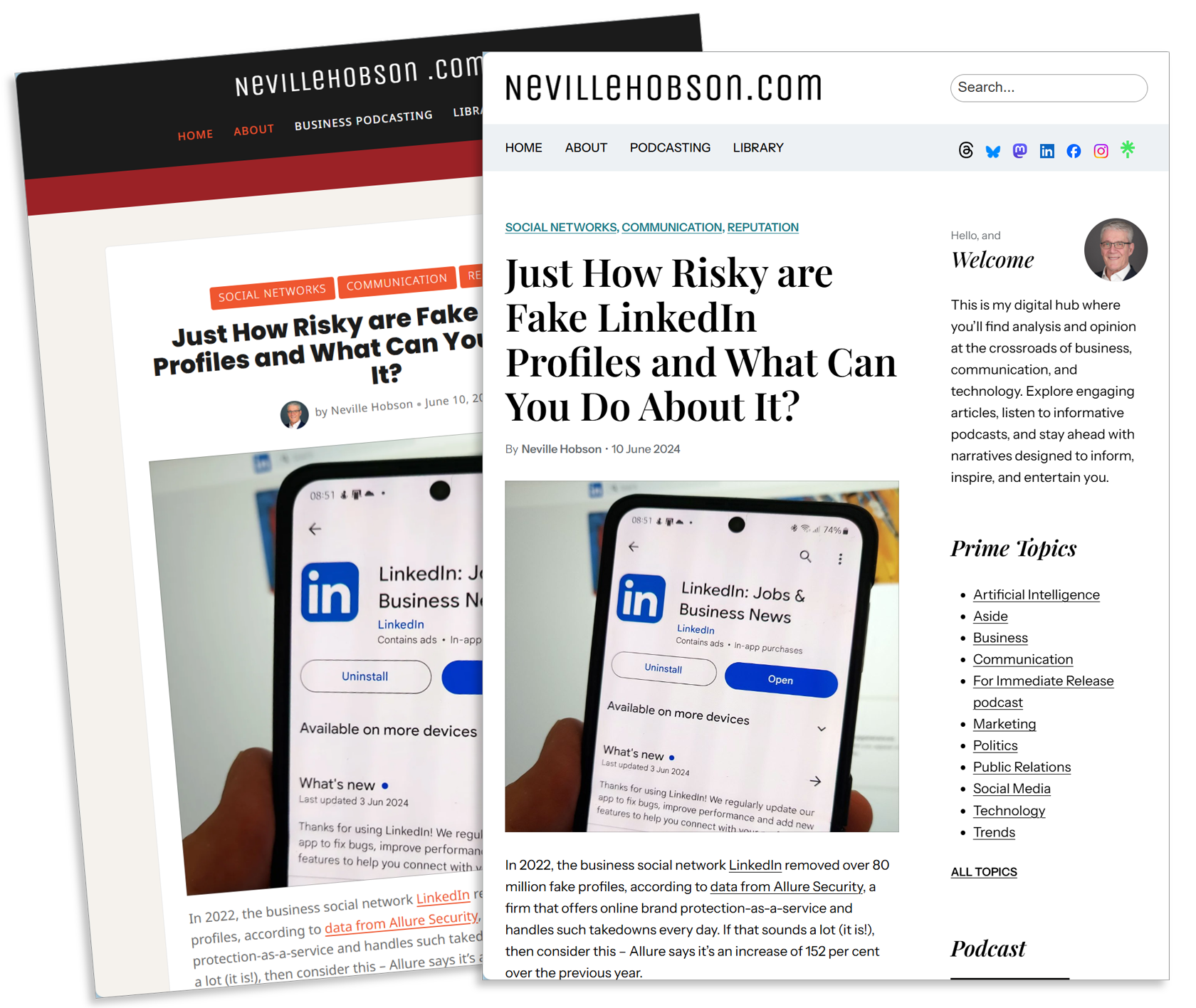
Hello, readers! I’m excited to unveil a fresh new look for NevilleHobson.com. The new minimalist design offers a cleaner, more intuitive interface. You’ll find it easier to navigate and access the content that matters most to you.
By decluttering the design, I’m putting the spotlight firmly on the content – the insights, analysis, and discussions that are at the heart of this website. Informal feedback from readers who subscribe to my newsletter has been a helpful influence in making such changes.
What’s New
- Cleaner Layout: The principles of minimalism, simplicity, and clarity have guided me in refreshing the site. The new design, on the right in the image above, emphasises white space and typography, making it easier to focus on the content.
- Improved Readability: The content is much easier on the eyes, allowing you to comfortably engage with longer articles.
- Faster Loading Times: By streamlining the design and reducing unnecessary elements, the site now loads faster compared to the previous design, ensuring you can quickly access the information you need.
- Mobile Optimisation: The simplified design ensures a more seamless experience across all devices, whether you’re reading on a desktop, tablet, or smartphone.
- Taking Advantage of Full Site Editing: The foundation WordPress theme I’ve used to create the new design lets me do that using individual blocks for text, images, videos, and other site elements in an intuitive interface, providing enhanced flexibility and design capabilities.
I’ve rewritten the About page that will make it clearer who I am, what the blog is about and what you can expect here. It addresses my own intent to make this page significantly shorter and a lot more focused than its novel-length predecessor that did waffle on a bit, as some friendly feedback informed me!
What Hasn’t Changed
While the look is refreshed, my commitment to providing thought-provoking content remains steadfast. You’ll still find:
- Insightful analysis of current and emerging trends in communication technology.
- Practical strategies for enhancing your corporate communication.
- Thought-provoking discussions on the future of business communication
Looking Ahead
I’ve set out the benefits I see of a minimalist design, such as improved user experience, faster loading times, and better readability. It also offers a friendly, conversational tone that aligns with a more informal approach compared to the previous design.
It’s worth saying that this new design is a work in progress, as I expect to soon fix a couple of things I haven’t figured out how to yet, and fine-tune some things over time. Thanks again to everyone who told me what they thought and for some very helpful suggestions. Now you see the new look and feel live, let me know if you have any further thoughts.
Related Reading:
- Key Themes in my Writing Agenda for 2024 – 3 January 2024


